
Sooner or later, businesses find themselves in need of a rebrand. It may be time to improve customer perception, advertise new products/services or refresh an out-of-date brand image. As industries and markets change, rebranding certainly has its benefits. Businesses must evolve to ensure their audiences find them relevant and keep engaging with the brand. Here are five examples of successful rebrands.
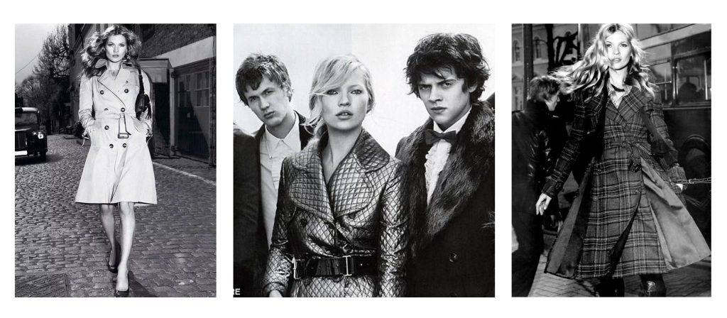
Burberry
Burberry began as an outdoorsman brand, worn by Arctic explorers and WWII soldiers. Once a symbol of country aristocrats, it took on negative connotations and became synonymous with gangs. In 2001, Christopher Bailey took over as creative director and introduced new clothing such as swimwear and trench coats.
Endorsements from celebrities like Kate Moss helped further distance the brand from crime and helped establish a new company unaffiliated with its previous perception. Thanks to its ability to tell a new story Burberry is now a symbol of luxury and wealth.

Market Pantry
Target is known for quality products and reasonable prices, but the generic look and feel of their Market Pantry brand wasn’t very appealing. Customers said the food images on the packages didn’t make them want to purchase this brand, because it just didn’t look that appetizing.
In 2016, Target decided to create a more youthful look by incorporating bright colors, expressive fonts, and varied background patterns. Not only are the packages now more visually appealing, but they also give customers easier access to the information that’s most important to them.
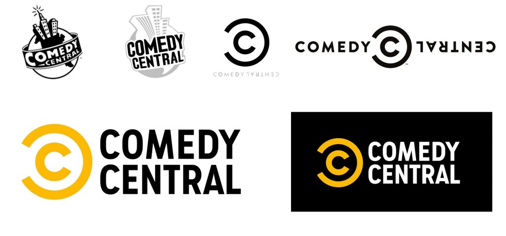
Comedy Central
Comedy Central has been through several rebrands, but their 2018 change made the best use out of minimalism trends. Their new logo is simple and more easily recognized with the black/white/yellow color scheme.
Comedy Central published a “brand refresh” press release that described some of their goals and how they are trying to achieve them. They focused on user experience and how people access their content (linear, digital, social, radio, podcasts, and live events), which is sure to bode well for their audience.
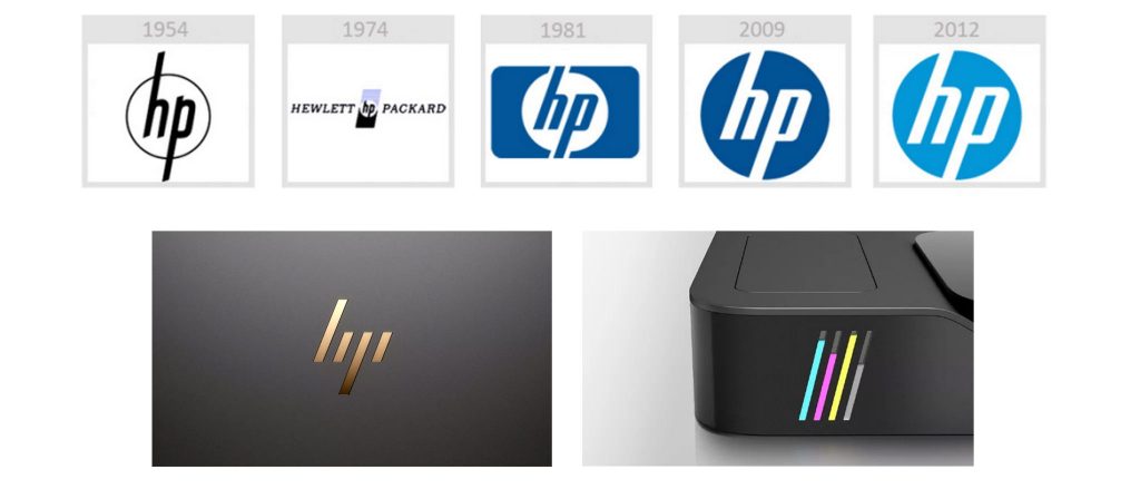
Hewlett Packard
Since 2008, Hewlett Packard (HP) has been trying to develop a brand overhaul to completely change the company’s vision and customer perception. With the release of a premium laptop, Spectre 13, HP also introduced a new 4-line logo. Set at a 20-degree angle, the abstract yet modern design encourages forward thinking and represents modern minimalism in the best way.
Redesigning the brand also meant HP redesigned how it did business. Everything from their website to product design to retail experience to user interface was changed to create a more unified, high-quality brand. HP continues to push design standards and develop products that are both relevant to consumer needs and perform well.
Related article: 5 Branding Fails
Apple
In the late 1990’s, Apple was suffering from low sales, lack of consumer engagement, and a saturated market. The company decided to rebrand its image with a modern and minimalist look. At the same time, they launched innovative products and produced advertising campaigns that focused on user experience and forward-thinking.
Apple was able to establish itself as a leader in the tech industry and attract a new, diversified customer base. Even to this day, loyalty and trust continue to fuel Apple’s unmatched success.
Customers need to be able to connect with a brand and understand its message. It’s important for brands to stay up-to-date and capitalize on modern marketing and design trends.
Put your brand to the test with our 17 Point Brand Inspection: