Minimalism is powerful. It’s used in marketing design to create intrigue and to communicate quality or luxury. A clear focus with fewer distracting elements helps your audience see your value message right away. It’s true. Less is more.
How do you move your marketing design in the direction of minimalism? Here are 5 tips to help you maximize the benefits of the less in your designs.
Tip #1: No Clutter
Minimalism is all about leveraging the bare essentials. Removing nonessential elements helps keep your design practical, visually appealing, and makes sure each element serves a purpose. Evaluate what you keep, including text. By removing competing and distracting elements, you focus your audience on the primary message of your marketing materials.
Tip #2: Limit Colors
This may sound odd coming from a graphic designer, but using fewer colors is a great idea. Using 3 colors or less allows you to create contrast, mood and theme selectively. Try using shades of the same color for a tone-on-tone look with depth and elegance. Many minimalist designs use black and white, as in the minimalist landing page design shown below.
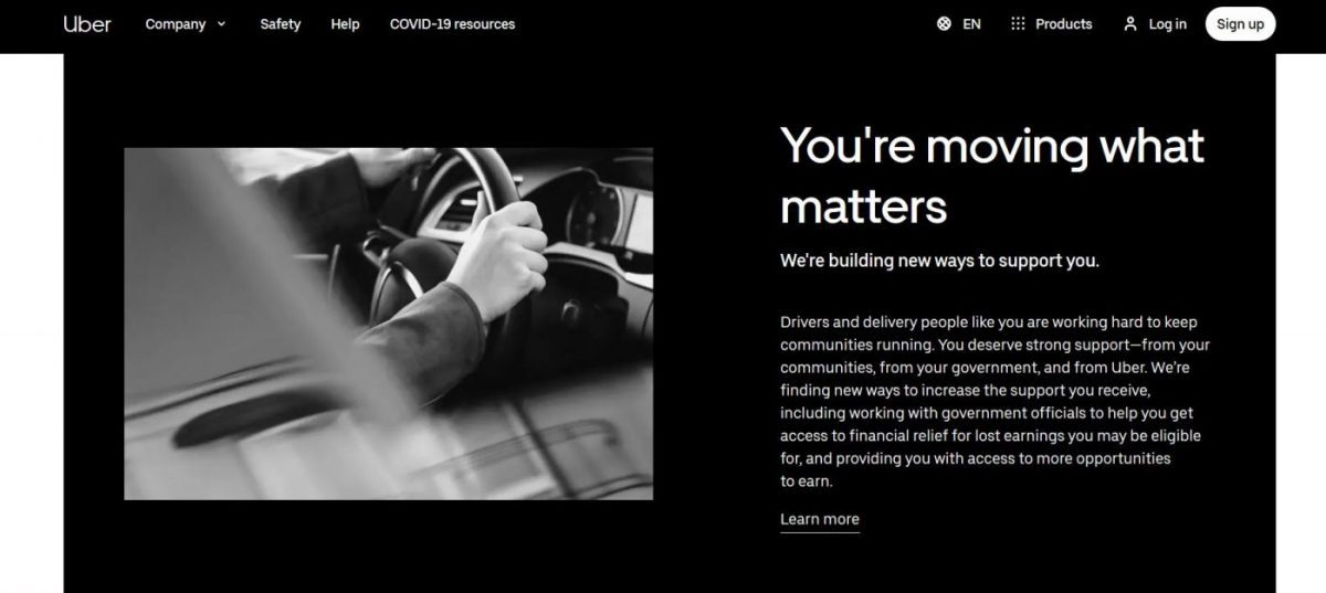
to focus on their value messaging to drivers in response to COVID-19 impact.
Tip #3: Essential Imagery
Images are essential to design. They create setting, feature products and communicate mood that supports your marketing message. In minimalist design, look for images that are simple, elegant and uncluttered. Images should have plenty of negative space (empty space) around the subject. If your imagery is bold, balance it with visually lighter elements like typography. Which brings us to tip #4.
Tip #4: Seek Balance
In minimal designs, there aren’t many elements to compete for attention. Create a visual hierarchy for your audience in your design. What should they see first, second and third? Do the items you’ve added to your design naturally draw the eye in the desired order? For every bold element in your design, seek to balance it with shapes, space, or visually lighter elements.
Tip #5: Be Font Picky
Clean, readable typography is most effective. Choose just one or two fonts. Use size and weight to create visual hierarchy between text elements. This creates visual contrast. Don’t be afraid to experiment with type to give your design a creative twist, just don’t sacrifice legibility. As in all minimalism, less is more. This includes the number of fonts, sizes and words in your marketing design.
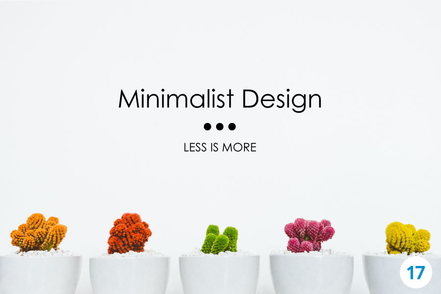
Related: 9 Rules for Minimalist Graphic Design [infographic]