
Choosing a font should never be an afterthought.
Something as simple as font choice can make or break a prospect’s decision about your company. Every font communicates something unique – each has its own personality. Selecting a font that conveys the personality of your brand is important to your brand’s image.
When choosing a font for your business, consider what kind of image you want to portray to your prospects. Do you want your font to say, “we’re all business all the time” or “we’re creative and innovative”? Once you have settled on the tone you want to communicate to your audience, it’s time to play around with font options that fit your company’s personality.
Here are a few things to keep in mind when scrolling through fonts:
Serif vs. Sans Serif
A serif font, like ![]() has accent pieces at the tips of each letter, whereas a sans serif font, like the one I’m using now, does not include accent pieces. Sans serif fonts are classified as more modern than serif fonts. They each offer a different look; it’s up to you to decide which fits your brand.
has accent pieces at the tips of each letter, whereas a sans serif font, like the one I’m using now, does not include accent pieces. Sans serif fonts are classified as more modern than serif fonts. They each offer a different look; it’s up to you to decide which fits your brand.
The battle has been ongoing to determine which type of font is better to use in the business world. There is no concrete answer, however several studies have shown that a sans serif font is easier to read online than a serif font.
Readability
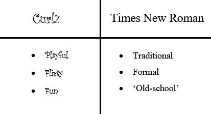
Choosing a font that is legible is a huge part of the process. While you want to select a font that is true to your company, you also need to consider the practicality of the font. Just because it’s unique and “pretty” doesn’t mean it’s the best choice. For example, I love script fonts, however,![]() (a font like this) is not the most practical. It’s not easy to read. A better choice would be
(a font like this) is not the most practical. It’s not easy to read. A better choice would be ![]() for a readable script font. Remember, if a prospect can’t read your message, chances are they won’t seek your services.
for a readable script font. Remember, if a prospect can’t read your message, chances are they won’t seek your services.
Consistency/Compatibility
Using too many fonts in one document generally looks confusing and unprofessional. It can visually overwhelm prospects and current clients who are looking for specific information. Find a font or two you like and stick with them. If you’re planning to use more than one font in a document, it’s best to use compatible fonts – fonts that are not identical, but complement each other well when used together. A good rule of thumb for using multiple fonts without it looking unprofessional is to use one font for headings and another for the body text in your documents.
Fonts have a bigger impact than you might realize. Having an illegible font could turn people away from your company before they even know what you do. Take your time and put some thought behind your font choice instead of accepting the default font that pops up when you start typing.