In website development, 2016 will be known as the Year of User-Experience (UX). It’s the year of people-first design. Watch “ease of use” and “emotional engagement”take center stage while debates over platforms and other issues fade into the background.
8 Trends that make 2016 the Year of UX:
1. Customer-Centric Design
Clean website design with plentiful white space, intuitive navigation, and user-friendly page structure is a standard expected in 2016. Websites must focus on visitors and what they want… or they will take their attention – and money – elsewhere.
2. Tile/Card Layouts
Pioneered by Pinterest, cards are now everywhere. They’re intuitive, and can be used to create a functionally interactive layout. Each card represents a single unified concept, presenting information in bite-size nuggets that are easy to digest and scan. Perfect for the TL;DR generation, they allow visitors to quickly identify the most important and relevant information.
3. Material Design
Google’s new style language is really catching on. Material Design updates flat design by applying shadow effects and the suggestion of movement and depth. This clean, modern design enables a unified experience across multiple platforms and devices. It’s content-focused, easily adapts to responsive sites, and offers a fresh twist to flat design looks.
4. Interactive Storytelling
Sharing a compelling story builds emotional attachment, trust and a sense of community. It encourages visitors to join you in something great. Interactive storytelling moves your visitors along an animated journey, presenting content in a unique, intriguing way that leaves them wanting more.
Examples of Interactive Storytelling:
Rule of Three.co.uk/ (copywriters)
Black Negative (motion, sound, animation)
5. Eye Candy = Curb Appeal
Take the time to plan and envision your customer’s journey through your website. Optimize every facet of their experience to make it more personal. Custom illustrations, moving pictures, and innovative use of text and color all contribute to a unique brand experience. We’ll look at those individually next.
6. Illustrations
Web designers are embracing imagery that engages the user in a more personal, connected way. Custom photography and illustrations are replacing stock photos. The trend is toward the integration of hand-drawn doodles. They’re folksy, unpretentious, and provide an element of warmth and charm.
![]() The Beehive Boston site has a hand-drawn logo & elements.
The Beehive Boston site has a hand-drawn logo & elements. ![]()
7. Cinemagraphs
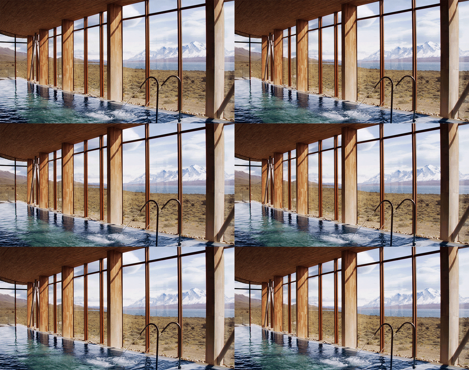
If you can’t decide between high-definition images and videos for your website, a cinemagraph delivers the best of both worlds. These moving images provide a sense of wonder and elegance, consume less bandwidth than video recordings, and are far more interesting than a simple still shot.

Photo by Jamie Beck & Kevin Burg
8. Bold Colors And Text
Color choices create strong emotions – whether on a handbag or a homepage. Expect to see an increase in variations of color, including hues that are saturated and vibrant. Bold colors complement dramatic typography, and designers are creatively using text comprised of images, textures, and patterns for custom effects.
Many changes are sure to come in 2016, but one truth remains: the design of your website should – first and foremost – focus on user experience. Give them one they will remember.


