You knew you needed a website. You built one and added your products and contact information. Now months or years down the road, your website traffic is basically nil and sales are suffering because of it.
What if your website homepage delivered on its promise to drive customer awareness and boost sales and revenue? It can. By applying the 7 principles below to your site’s homepage you’ll be well on your way to a website that is optimized for conversions.
High Quality and Original Photos
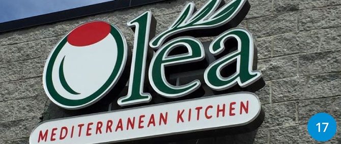
Using high-quality photos of your products or services communicates credibility to your ideal customer. High quality images suggest value to your visitors without saying a word. Stock images are a convenient and budget-friendly option, but they can lack the personal touch that original photos convey. Whether you use stock photos, original photos or a combination… make sure they are clear, quality images.
Using photos that are specific to your company’s brand helps you connect in a relatable way and build trust with your audience.
A Clear UVP (Unique Value Proposition)
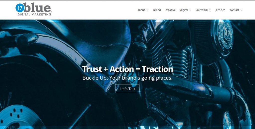
When someone arrives on your homepage, it should be clear to them how your company’s products and services provide unique value. Often this message is one of the first things your visitor sees. It may appear in a video or other form, but it is usually “above the fold” – meaning it is at the top of the site before you scroll down to more information.
Client Testimonials
Social proof is an excellent way to build trust, establish your expertise, and provide an up-close look into your products or services. Testimonials not only help customers place their confidence in your company, they also have a positive impact on sales!
Social Media Links
As your social following grows, you increase your potential website traffic and vice versa. By placing social media buttons on your homepage where they can be easily found, you are giving your audience a way to interact with your brand on multiple platforms. This gives them a 360-degree view of who you are and what you have to offer.

Overview of Key Products and Services
Your website visitors want to know what’s in it for them. Around here, we call this BLUF: Bottom-Line Up Front. Providing quick access to key product and service information is best. It gives customers quick satisfaction and clear understanding of your offerings. It also helps promote actions like shopping, inquiring or learning more. Including this keyword-rich information on your landing pages can also give your website a needed boost on various search engines.
Strong Call to Action
When a visitor interacts with your homepage, it should be clear to them what action you would like them to take next. This can be achieved by placing a strong call-to-action above the fold that entices the customer to the next step in the buyer’s journey.
An enticing CTA can be linked to a limited-time offer, a contact form, gated content, or any other action you would like them to take.
Clear and Concise Navigation
People visit your website because they are looking for a product, trying to solve a problem, or have a question they want answered. Therefore, it’s very important for a visitor who lands on your homepage to immediately know where to find what they are looking for. If they have to think about it too much, they’ll leave and find it elsewhere. Make sure your navigation menu is intuitive, all the links work and important information is just one click away (not 4 or 5).
If your site has a lot of information, include a search feature in your navigation. Well-planned, easy to use navigation reduces bounce rates.
Each website homepage and landing page is unique and designed for specific purposes, but these 7 essential items are important for you to consider. How many does your landing page have in place?
