There are many essential principles that go into great graphic design. It takes practice to master them, but it’s important to recognize them in your own work and the design work of others. Here are the top 8 principles to apply in your next graphic design project.

1. Alignment
Aligning elements within a design creates a visual connection throughout the space. Elements aligned with each other give an ordered appearance, even if they are not in direct proximity. This eliminates the feeling of randomness in placement and conveys they belong together.


2. Repetition
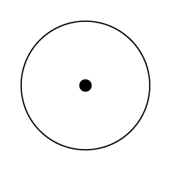
A viewer’s eye should move through a design smoothly, in a planned order while recognizing key focal points. Repetition creates a rhythm to take the viewer’s sight line through the overall piece with consistently placed elements such as a logo, color, or shape. Repetition also creates brand consistency,. A master of this element, Target’s many ads with repeating red dots and rings are easily recognizable.


3. Contrast
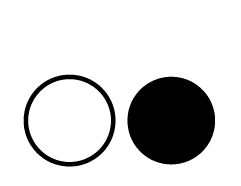
Within a design, contrast is effective in attracting the viewer’s attention to key elements. Often, contrast is created with two opposing design elements such as light vs. dark or large vs. small. The contrasting elements ensure the design is legible and help viewers to see the most important elements first. When Apple released iPod, it used bold contrast to draw attention to its focus on unique user experiences with their device.


4. Hierarchy
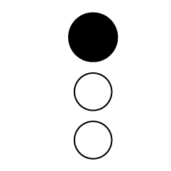
Hierarchy in design creates a visual weight where the most important element or message is emphasized. This can be created using contrast size or boldness. For example, a title can be larger, bolder, more detailed, or more colorful.


5. Balance
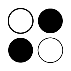
The visual weight of each element within a design play a key role in the overall stability and structure of the design. Shapes, images, and text boxes all hold different visual weight that can be distributed either evenly or unevenly. Balance can be either symmetrical or asymmetrical. A strong use of balance is used below to create drama and a sense of tension in the movie poster for 127 Hours.


6. Color
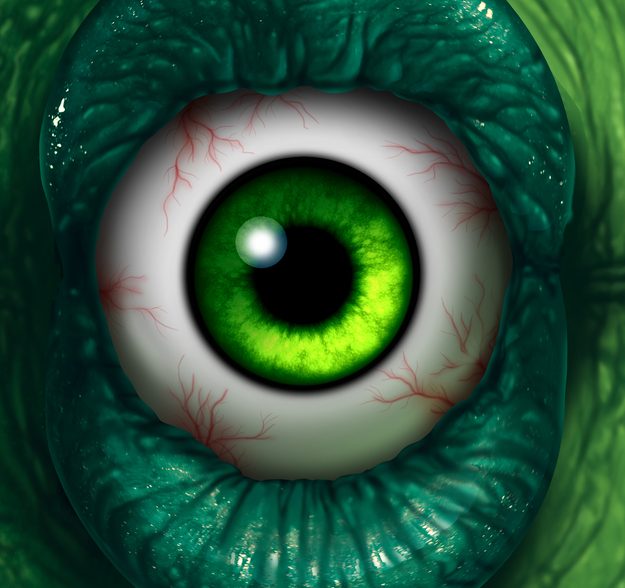
Having a basic understanding of color theory is handy when designing. The colors you select – your color palette – will represent your brand and its character. Color palette also supports the tone of any design. Color can be used to create contrast or to complement the design elements. There’s a reason Disgust and the Hulk are green.

7. Space
Empty space around your elements it called negative space. Negative space is important for clarity and focus in design. In some designs, negative space is used creatively to highlight key elements or create subtly hidden shapes. In the fashion brand logo created below, our team worked with the emerging designer to create a lion’s face in the negative spaces of a tree. Note also, that the logo is placed on a wall with room around it. That space prevents crowding and establishes dominance for the logo element.


8. Typography
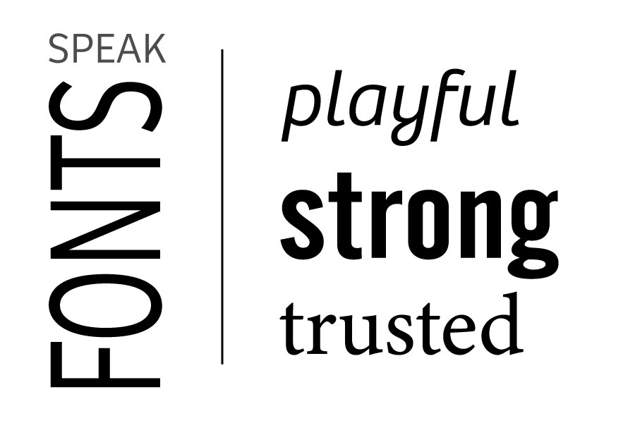
The font that you choose for a design will speak for your brand. Whether you choose a stylistic or customized font you want to choose what best suits your brands tone. Scripts and non-standard fonts lean toward creative and playful tones, while straight, solid fonts lean toward serious or trusted tones.
Once you are comfortable with these 8 important elements of graphic design test applying them. Examine how each one effects the composition and effectiveness of your designs. After you have a little experience with them, push the boundaries and experiment with what is most effective for different graphic design purposes. Remember to create relationships and visual connections through the design elements as you work. Have fun designing!
Need help getting your brand designs locked in and working for you? Contact our design team at 910-938-4319 and we’ll make it easy.


