Color is Clearly Important
Color selection and use in business marketing and sales is important for a variety of reasons. Color attracts attention, impacts trust, increases recognition, and associates emotion. Ultimately, color engages people. And we want engaged people. A research report published from the University of Winnipeg states, “Color is ubiquitous and is a source of information. People make up their minds within 90 seconds of their initial interactions with either people or products. About 62‐90 percent of the assessment is based on colors alone.” (Impact of Color on Marketing)
If color is this important for making an impression, is there one “best” color for a logo? Research and market testing say, “No.” Large companies across multiple industry sectors have found huge success with every color of the rainbow. Here’s an illustration of established brands by color. As you can see… success can come in every color.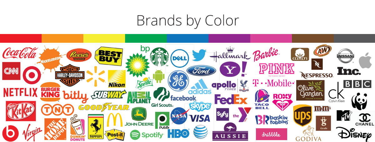
Beats is branded strongly in red, Skype and Twitter are solid in blue. T-mobile brandishes a bright pink while BP and Android have gone green. Color choice matters but not in isolation. Factors such as personal experience and cultural influences affect an individual’s associations with color. However, color choice matters immensely in the greater context of product relevance. (We’ll get to that in a second.)
Color is personal and subjective.
People are complex. They’re also shaped by experiences, cultures and beliefs. This affects emotive responses to various colors. Because we’re all different, there is no one “perfect” color for marketing. We have also been taught through education and experience to expect certain things a certain way. Blue sky and green grass make the most sense to us.
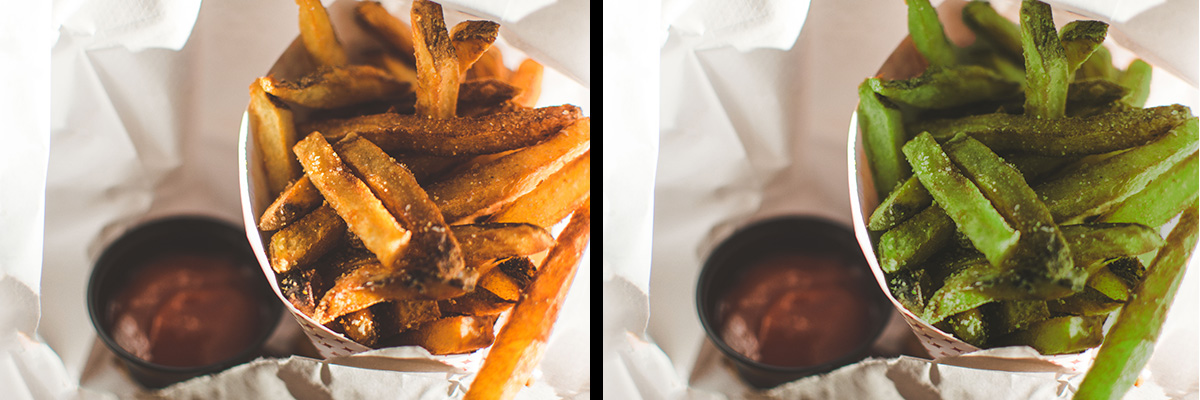
If you grew up in the desert like I did, you may prefer green (ahhh… leaves!) over brown (ugh.. dirt!). But if you order your favorite french fries and they come to your table in a green hue instead of golden brown, you will likely recoil or lose your appetite. Your brain’s experience says a french-fried potato should be golden brown. Green may = mold. This creates an instant mental roadblock. Now picture a salad that’s brown instead of green. It creates the same problem. Your education and experience have taught you some things should be green and some should not.
Cultural differences can also affect our thoughts and feelings related to colors. In the US, red is sometimes called a “power color” and can be associated with action (hitting a target) or romance (Valentines, roses). In most American Indian cultures, red is a sacred color. In Nigeria red represents aggression and vitality. In some African nations red is associated with death. In Asia red signifies good fortune and appears in weddings and other special celebrations.
Much advice has been offered on picking the best color for your brand based on the “feeling” you want customers to have. Advice is often given by industry, as well. There’s some merit to those lines of thought and I’d agree with several of the common suggestions. But if individuals have different feelings about colors, and tech/media companies (all in a similar industry category) are hugely successful using green, black, red, blue and hot pink… How do you frame color choices for success?
Perceived Product Relevance is Critical
There’s significant research that indicates color choices perceived to be appropriate to a product/brand are a significant factor for consumer buy-in. Research also shows that a brand’s use of color is connected to how customer’s perceive the brand’s personality and authenticity. That perception of personality and authenticity dovetails into persuasion and conversions. The “right” color has more to do with appropriate fit than the actual color chosen. Your color choice is powerful in the context of your brand’s desired personality.
Imagine you’re in the market to purchase a John Deere tractor. John Deere is a huge brand well known for it’s down-to-earth, rugged brand. What imagery comes to mind when you think of John Deere? Brown jackets, work boots, ball caps, heavy equipment, camouflage, fields, plaid or flannel? The primary brand color is their “tractor” green. A green you’d expect to see on a big yard or in the fields. It’s paired with yellow, browns, or black for products and advertising except in their women’s merchandising where it is paired with a soft pink. Green, yellow, brown and black are all colors you’d expect to see in the fields on a farm. What if their tractor was purple? Would that feel as appropriate or “fitting” in the minds of consumers?
![]()
Like the green french fries or brown salad we discussed earlier, a color that doesn’t “make sense” in relation to how a product or service is used doesn’t “feel right.” That creates friction in the consumer’s perception of a brand’s personality. This friction impacts feelings of trust and value, making the sales process and conversions far more difficult.
Color choices in branding must be made in context. What product or service do you sell? What will fit the perceived product relevance in your consumer’s minds? Does it fit your brand’s personality, values, story and desired image in the marketplace? The specific color you use matters, it just matters more in the context of “feeling right” to your buyers.
Wider Color Preferences
There are some preferences that are broadly true for certain colors and can be useful in making selections within the context of product relevance. For example, as referenced in our tractor example above, brands that have rugged, outdoor applications find stronger resonance with earthy colors like browns, greens, warmer yellows/golds and black. A high-fashion or beauty product designed to make a woman feel elegant, exquisite and sophisticated would likely find consumers relating well to purples, while most would still agree that red creates a sense of drama and excitement.
Gender also drives color choices in a few ways. In an analysis published by Kiss Metrics, both sexes named blue as their favorite color most often. Women name purple as the second most favored color, but most men dislike purple (third most disliked color). Men tend to gravitate toward colors that are more intense or have darker shades. Women tend to prefer softer colors and lighter tints.
Cultural norms and established market trends also affect what US consumers expect to see for certain industries. But ultimately, your color choice should fit your product in a relevant way to buyers and support your desired brand personality and image.
Additional sources:
The Interactive Effects of Colors | Exciting Red and Competent Blue
Color Psychology: a critical review |Dimensions of Brand Personality