Commerce might get complicated, but for high-impact business logos, simple is better. The most successful logos are easy to remember and easy to understand. Effective, iconic logos communicate a clear message, distilling the essence of your company down to a single graphic that resonates with your customers.
Why Complex can be a Problem
A complex logo design may contain a lot of information, but it’s also more difficult for consumers to quickly understand or retain. If it’s too much, it could be sabotaging your brand design and promotion efforts. Simple logos are easier to recognize and recall because humans can commit a smaller amount of information to memory faster.
With all the branding that we see daily, it’s understandable that much of what we see gets lost or forgotten. UCLA professor Alan Castel commented on this phenomenon saying, “…that’s natural. We don’t burden ourselves with information we don’t think we’ll need to use.” When designing or refreshing your logo, remember if it takes too much thought, it’s likely going to hit the mental “file 13” before you even get started.
Ezzell’s for Example
Ezzell’s is a company with multiple divisions: event catering, wedding cakes, a cookie company & food truck. Their common ground: great food. Ezzell’s needed a logo that could fit elegant weddings and catering, but simple enough to also fit their cookie operation & food truck. With a fork hidden in the E, it’s clever but still visually simple.
Cue Happiness (enter stage right)
A logo is a visual cue for the brain of emotional humans. Customers remember their experiences best and your logo is a visual cue associated with their experiences. Customer brand experiences include every interaction they have with you and their feelings about them. Messaging, advertising, customer service, transactions, products, complaint resolution and more all impact their emotive experience with your brand.
Simple iconic brands can evoke a full-range of brand experience emotions. Nike’s “swish” speaks to athletes and competitors. Apple’s iconic logo connects geek-goodies and users across the globe. NFL, NHL or NBA… much the same.
The emotional effectiveness of simple design in a world full of users on smart phones with app icons have made it a hugely successful trend in marketing and design. It’s appealing especially to Generation Y. Millennials are passionate brand fans drawn to simple designs.
Naked is Harder to Fake
A simple logo concept also effectively discourages counterfeiting. A competitor might be tempted to create a logo similar to yours in hopes of benefiting from your status and following in the marketplace. When a logo is complicated, only a few details need to be changed by another company interested in co-opting the goodwill and trust you’ve built for your brand. However, when your logo is simple, with only a few colors and details, competitors are less prone to blatantly copy it and others are more likely to notice that “something’s not right.” Even though you probably couldn’t draw the Facebook logo from memory, you can probably tell at a glance which one below is a knock-off.
Wider (and Wilder) Applications
A simple logo is scalable, making it much easier to reproduce in multiple formats – and on anything. From full color print and web use to one-color stamps and promotional items, a simple design stands the test of usability in both large and small spaces. A complex design can get lost when reduced to a name-tag or pen barrel.
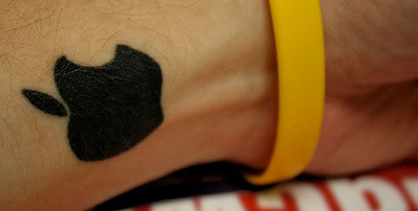
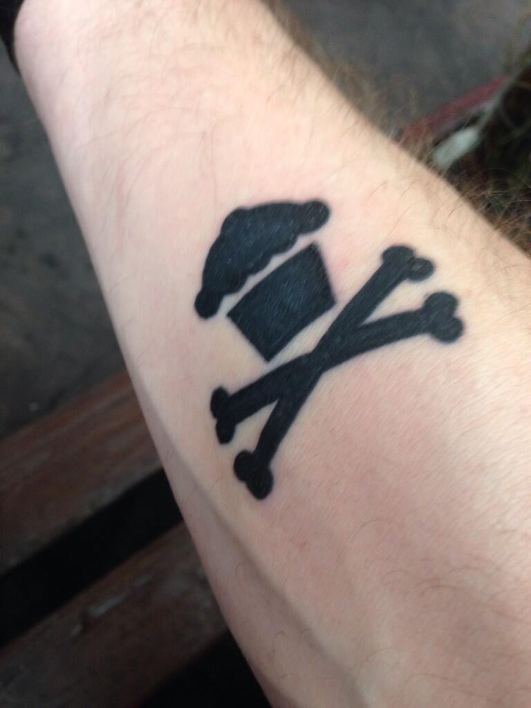
Hey, if you’re really good, you might find thousands of your fans wearing your logo as a tattoo… Much like Apple or @johnnycupcakes.

photo: popsugar.com


Photos: johnnycupcakes.com
Your logo a visual icon that ties together all of your customer’s brand experiences. It’s a representation of your company, your culture and your value promise to your fans. Deliver on that promise and match the experience with an icon they can recognize immediately. As you build brand awareness, your logo will scale with you.. rewarding you many times over for your decision to keep it brilliantly simple.


