Landing pages are where your visitor lands when it’s time to take a specific action. What is it that entices a visitor take the desired action? Today, we make the case for visual currency… the sales conversion value of your landing page design. Keep in mind that landing pages are not just home pages. A website can have as many landing pages as they have offers for conversion. However, all landing pages are portals for entry and many times a first impression of your company for prospective customers. And first impressions matter… a lot.
Let’s look at a few design tips to make your landing pages convert prospects to leads and leads to customers. Landing pages should be visually welcoming and attractive. This is the start of a beautiful relationship – put your best foot forward. Taking these few pointers to heart can reduce friction on landing pages and turn them into visual currency that creates sales revenue for you.
Less is More. Period.
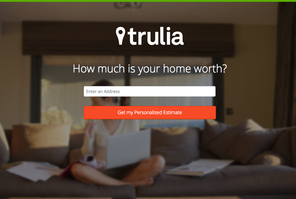
Remove everything that could distract from the one message you want your visitor to see. Trulia has nailed this one. Take out unnecessary navigation, links and descriptions. Keep your landing page visually relevant with a great photo background or image and keep the entire page focused on one desired action. Don’t get caught up in lengthy explanations and jargon. Keep it simple and inviting.
Use the fewest number of form fields possible on your landing page. Asking for less info up front is less invasive for your visitor. Fewer form fields produces less friction and increases conversions rates notably.
Make a Clear Call to Action
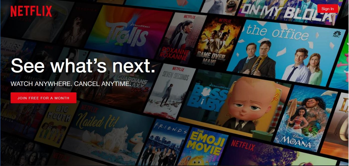
This call to action on the Netflix landing page is clear, concise and tells you what you’ll get to do. It directs the user to the desired action [join free for a month] while visually highlighting the value of the product offered. The image in the background shows popular choices available to subscribers, subtly nudging the visitor to make sure they have access to everything they want to see. Their call to action – See what’s next – is the value they offer, and if you don’t join… you’ll miss what’s next. (And who wants to miss what’s next?)
Yes Simple – but NOT Boring
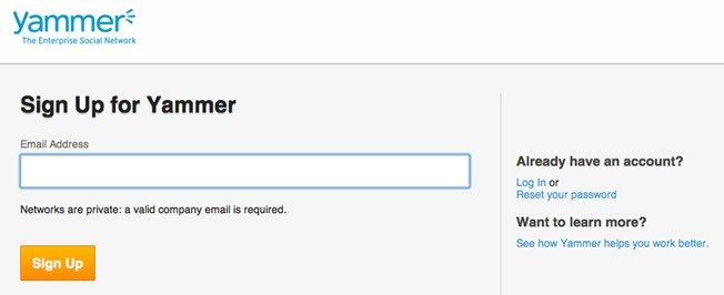
While you want to keep your messaging clear, direct and focused, a landing page that lacks visuals designed to appeal to human users is boring. This Yammer landing page is less than impressive. It may be short, but it’s also missing any compelling visual support for why we should sign up. … yawn.
Create Curb Appeal
If you think of a landing page as a front door for your business, create some curb appeal. Whether it’s a background or a prominent header, use a photo or video on your landing page that is engaging. Make sure it has some color and supports the value you are communicating. Make it easy to find the action button and clear what you want the user to do.
Still not sure you’re up for creating landing pages that convert for sales? Don’t hesitate to reach out to a marketing expert for advice. Hint, hint…we love landing pages!